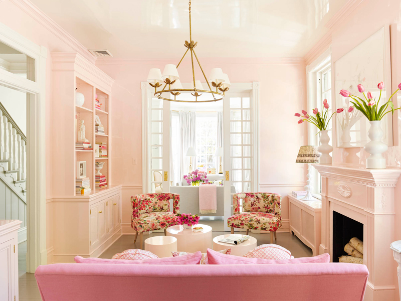
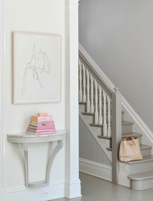
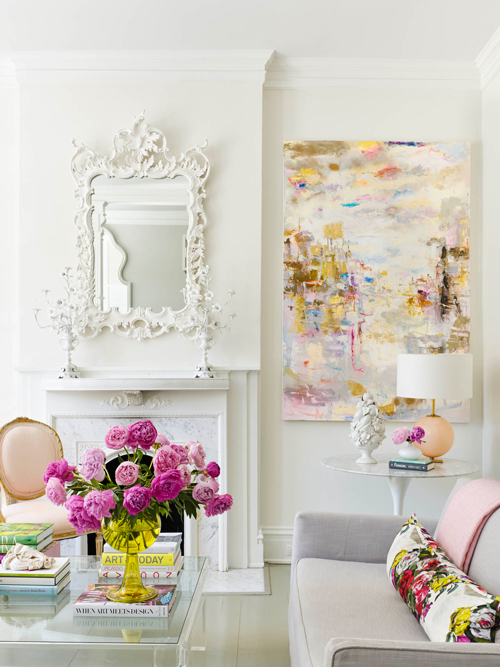
When this Virginia townhouse designed by Suellen Gregory graced the cover of House Beautiful last year, my jaw pretty much hit the floor. I’d never seen so much of my very favorite color in the world done in such a sophisticated and wonderful way. So when Suellen recently published never-before-seen shots from the home on her blog, I was thrilled! She shared some never-before-seen shots and since I can simply never get enough of this house, I had to share them here. Scroll to the end to see how you can get the look in your own home – both higher-end and on a budget!
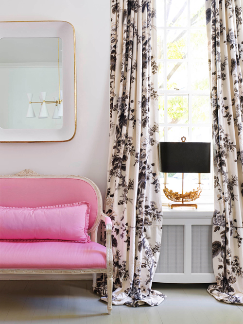
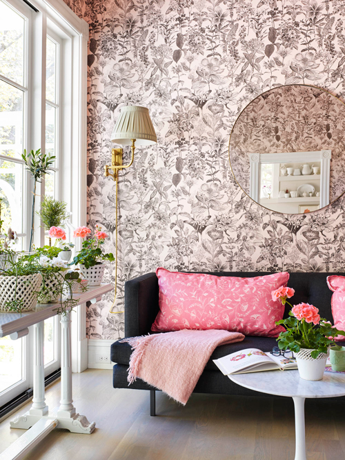
What makes this home so sophisticated and clearly the home of an adult, when it’s all done up in shades of pink and especially blush? How did Suellen manage to make it not look like a nursery? I think there are a few key factors…
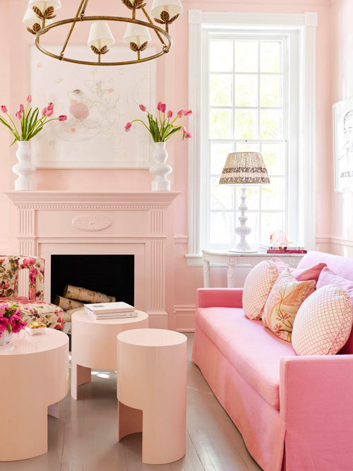
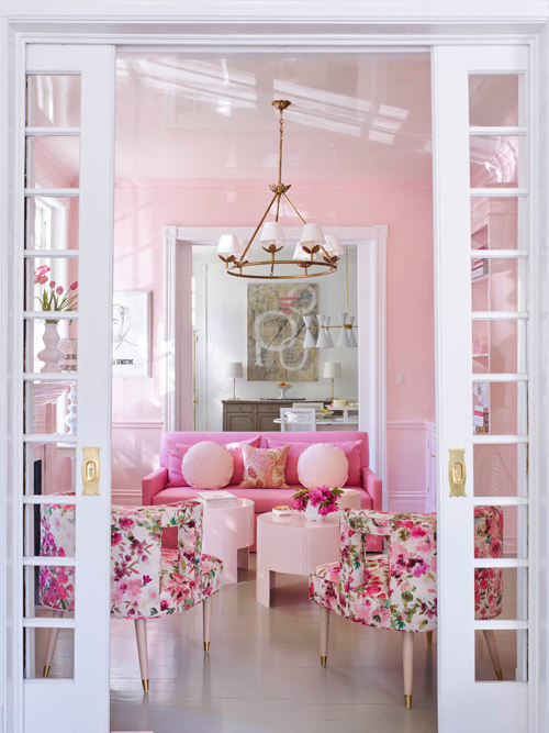
One of the big things that stood out to me was her use of sofas with straight lines and modern, masculine shapes – no tufting or curved backs, which might have been too much with all of the pink. The floors are neutral wood, and she kept the walls neutral as well in all of the rooms except for the lacquered sitting room – which makes that even more of a standout. Also, employing the stunning lacquer treatment just ups the sophistication factor immediately – it creates a high-end look that’s incredibly rich and full of depth.
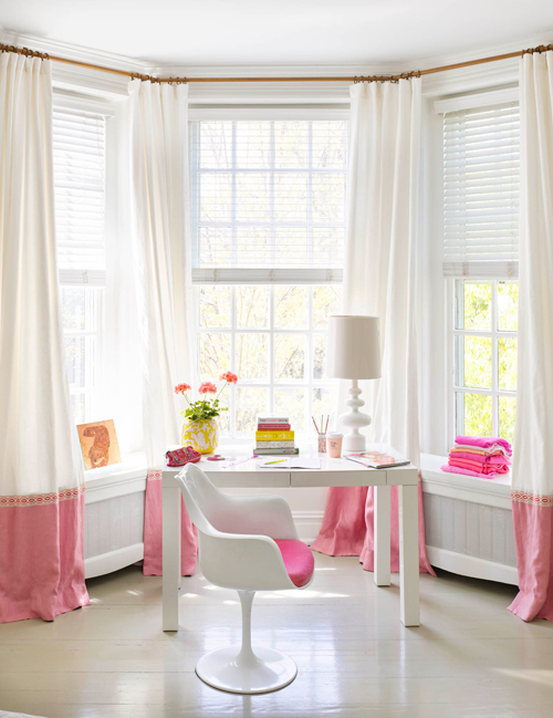
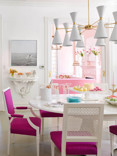
If you examine further, you’ll see the she used a lot of pieces with clean, straight lines – the dining chairs, the coffee table, the Parsons desk. Even though she used the most girly color imaginable, by keeping the lines of the furniture more masculine, she avoided a girly overload! Although there are some, there isn’t an overabundance of curvy shapes, tufting, or frills…a nice juxtaposition to keep the look sophisticated.
Black and white florals feel feminine, but a little edgy. And black and pink are always a winning combo!
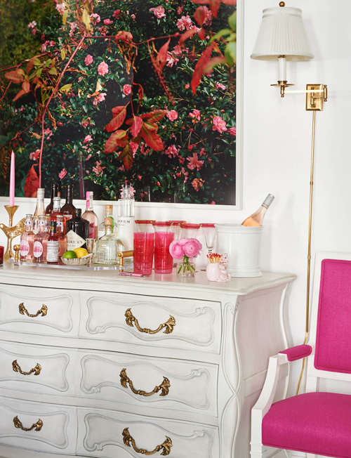
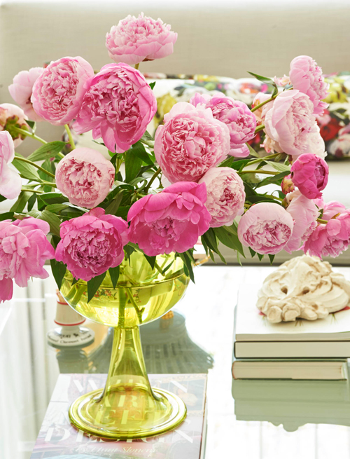
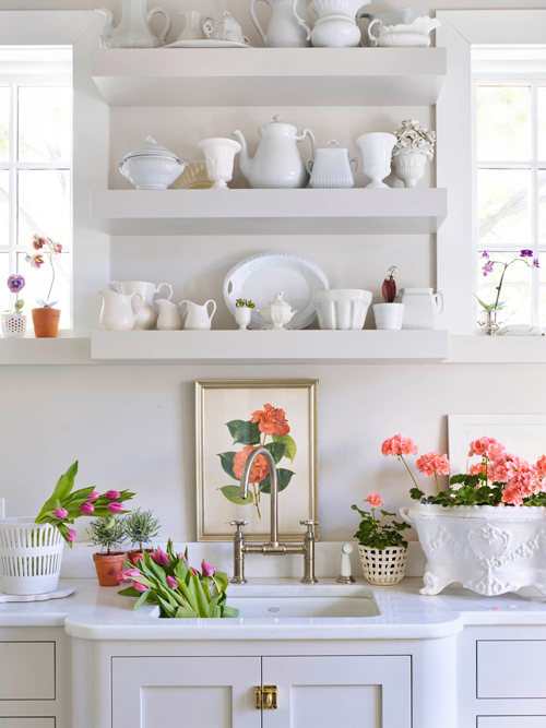
If you look, aside from the lacquered sitting room, most of the other rooms are actually predominantly white with some vibrant touches of pink – a brilliant move that keeps the color from feeling overbearing in the home. She also used a variety of different shades of pink to keep things interesting and far from flat – from palest peach to deep, rich raspberry, and every tint in between!
Here’s how you can get the look in your own space:
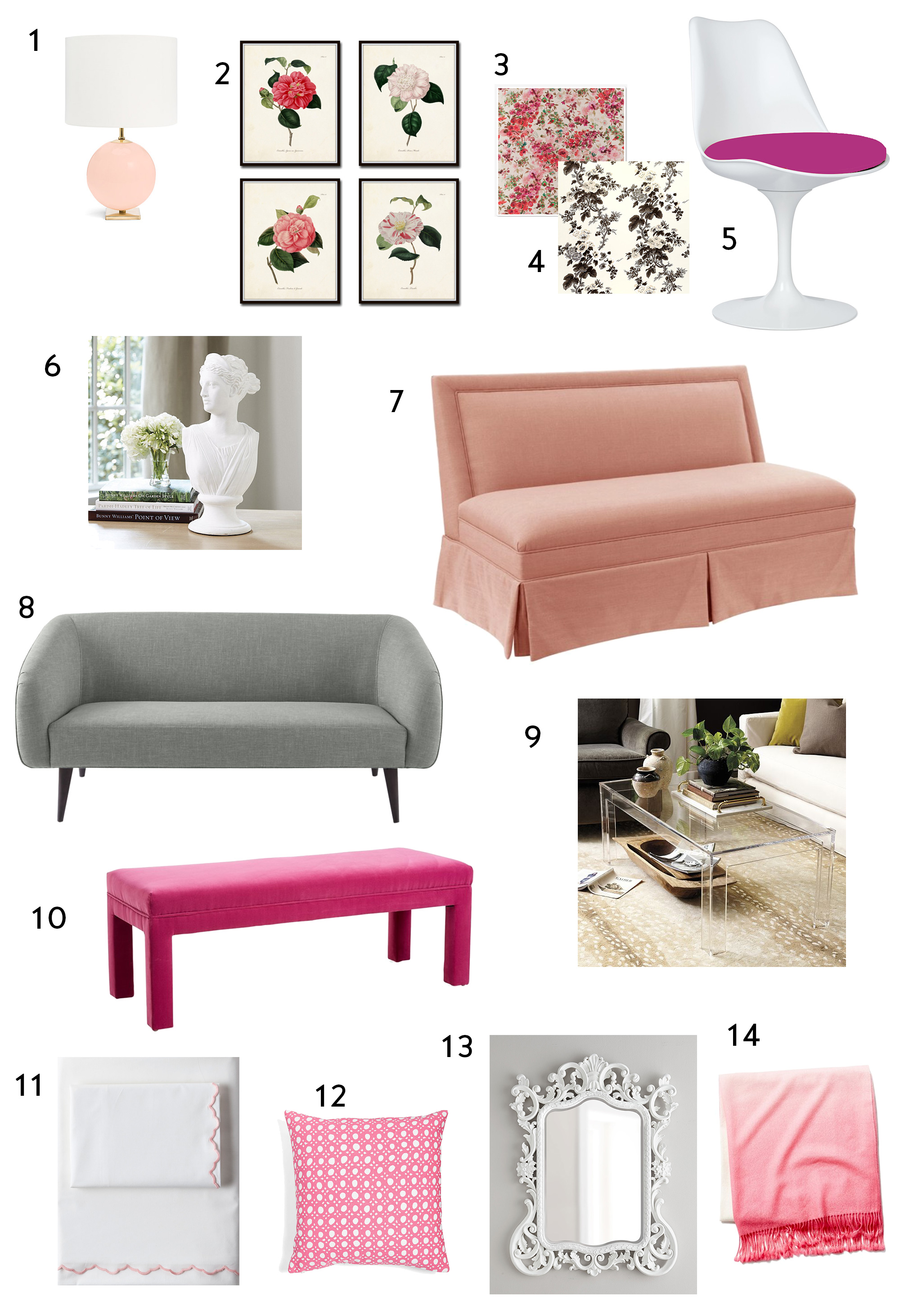
1 // 2 // 3 // 4 // 5 // 6 // 7 // 8 // 9 // 10 // 11 // 12 // 13 // 14
And here are some options to help you achieve a similar look for a lot less:
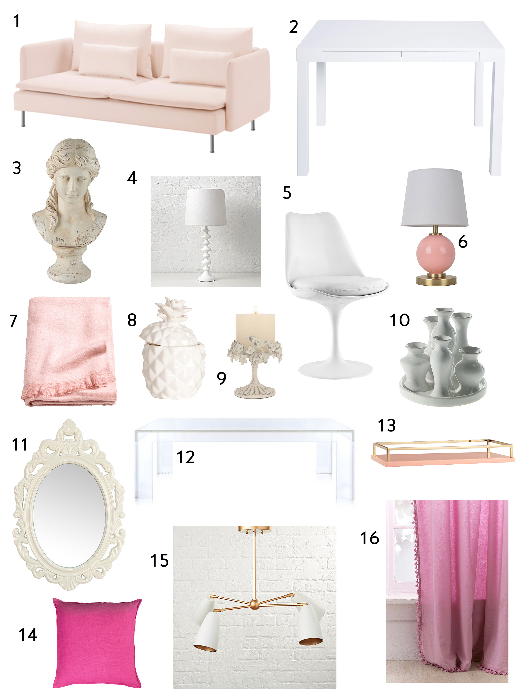
1 (my friend has this sofa and it’s super cute, and comfy!) // 2 // 3 // 4 // 5 // 6 // 7 // 8 // 9 // 10 // 11 // 12 // 13 // 14 // 15 // 16
all images via suellengregory.com photography by Annie Schlecter

I love pink myself. Will use some ideas from this!
So many good ideas in this space!
Love this – you need turn this into a regular series!
I’m so glad to hear that – I will definitely do more! xoxo
Great post. Amazing home and love the high/low sourcing. And I know it takes a lot of time to do all that sourcing. Its appreciated!
Thanks Mom! 🙂
Love this post. I think the modern art plays a big part in keeping it from being frilly. Thanks for sharing.
Great point! I agree completely – art always makes such an impact and especially true here.
I love all of these picks, Jackie! I’ve enjoyed following along with your own decorating on Instastories, keep it up 🙂
These rooms are stunning. Pink is my favorite color, and I agree with you that the way she pulled this look together, it definitely feels “grown up” and not overly girly or child-like. The photos are like eye candy. Thanks for sharing!
Love this! I’m a pink girl for sure
I have a pink feature wall in.my bathroom..get lots.of compliments about it
BLUSH is a neutral and just remodeled/redecorated my French Normandy in my fav pinks, teals and whites…maximalist style of French/English cottage GLAM coastal. It works beautifully…antiques with traditional furniture, all new wallpaper.I get raves and now entertain more. Open House tea at Christmas. Wish my iPhone could send photos.