One of the first things I was excited about when it came to the new apartment was painting it GREEN. I’ve had green on my mind for a while, I think mainly just because I kept coming across green interiors that I loved recently. Here are some of the ones I’d saved – above, Stacie Flinner.
I feel like there must have been more since I was so dead set on the green idea, but that’s all I can find/think of at the moment.
When it came to choosing the actual shade of green, I knew I wanted something different from what I’d used in the past. In the kitchen of my studio I used Farrow and Ball’s Green Blue, (inspired by this home tour), which is a lovely, soft, what-can-only-be-called aqua shade of green (they actually classify it under Blues on their site, but to me it was green!). I’m not a fan of aqua but this was fantastic – because it’s Farrow and Ball. They just have the best colors, so you can sit there and be like “I don’t like aqua,” and guess what. F&B will have an aqua you love. But anyway, I knew I wanted to do something more moody, something darker, and something with a more cozy, British type of vibe (despite the inspo pics I just shared, which are all light greens). I went to my local F&B on the Upper East Side and asked for dark greens. The one I knew I wanted to try was Green Smoke, and then I also got a couple of others – Card Room Green and Calke Green. I also had previously ordered a swatch of Current Mood from Clare Paint. It was nice but I kind of quickly disregarded it after seeing the Farrow and Ball colors. These lived on my wall for a while:
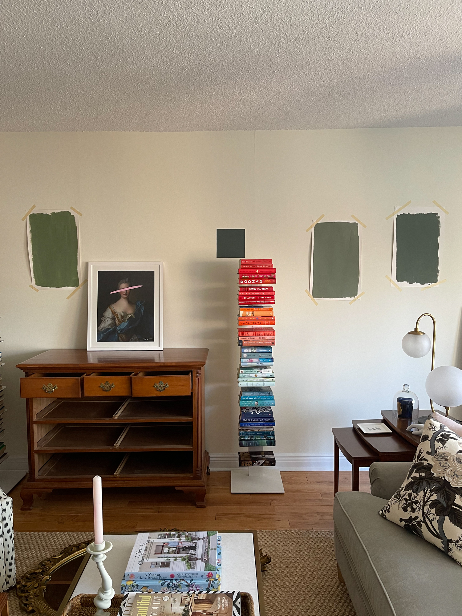
Calke Green on the far left immediately felt too yellow to me so that was knocked out of contention (though I left it up on my wall for a long time for some unknown reason), and I immediately loved Green Smoke (far right). It felt a little blue-green, really moody, and ultimately just really beautiful. But, it was also really dark. I wanted to go dark…but I wasn’t sure it would look good, because this place just doesn’t get a ton of light. I really wrestled with this a lot because I love the color so much – and having never gone dark before I really didn’t know if it would work or not. I liked Card Green Room (second in from the right), but for some reason I wasn’t over the moon for it.
I wasn’t sure what to do so I decided to go back to Farrow and Ball and get a totally different green – Breakfast Room Green. I forget what actually made me do this, I think I must’ve come across it online or something. That went up on the wall:
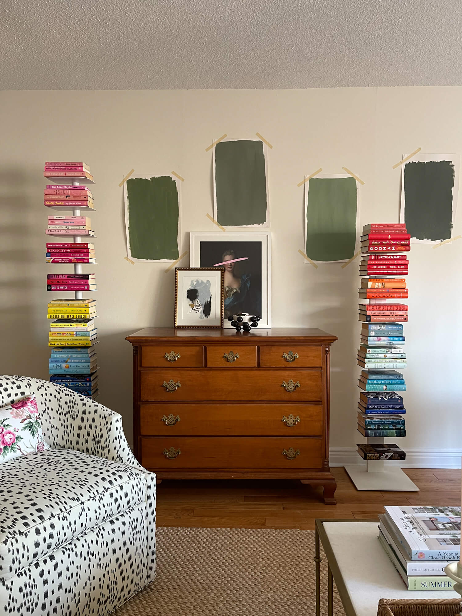
There it is second in from the right. I loved it. Breakfast Room Green is THE prettiest green (this picture is ridiculous and the coloring isn’t accurate, it’s so much nicer than this) and I am truly in love with it. It’s like springtime in a paint can. And for a while I really thought I was going to use it. But as I kept looking, I just kept feeling that it was too cheerful. Too pretty. Like just not the moody, English library vibe I wanted for the living room. I would’ve loved it for the bedroom or my previous apartment. But for here, much as I loved it, it just didn’t evoke the mood I wanted.
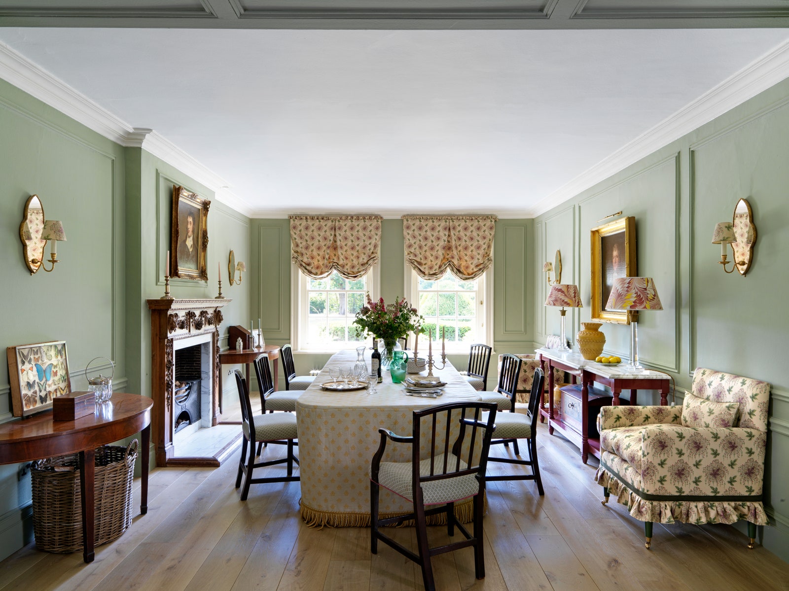
Then, like a gift from the gods, this beautiful image dropped into my Instagram feed:
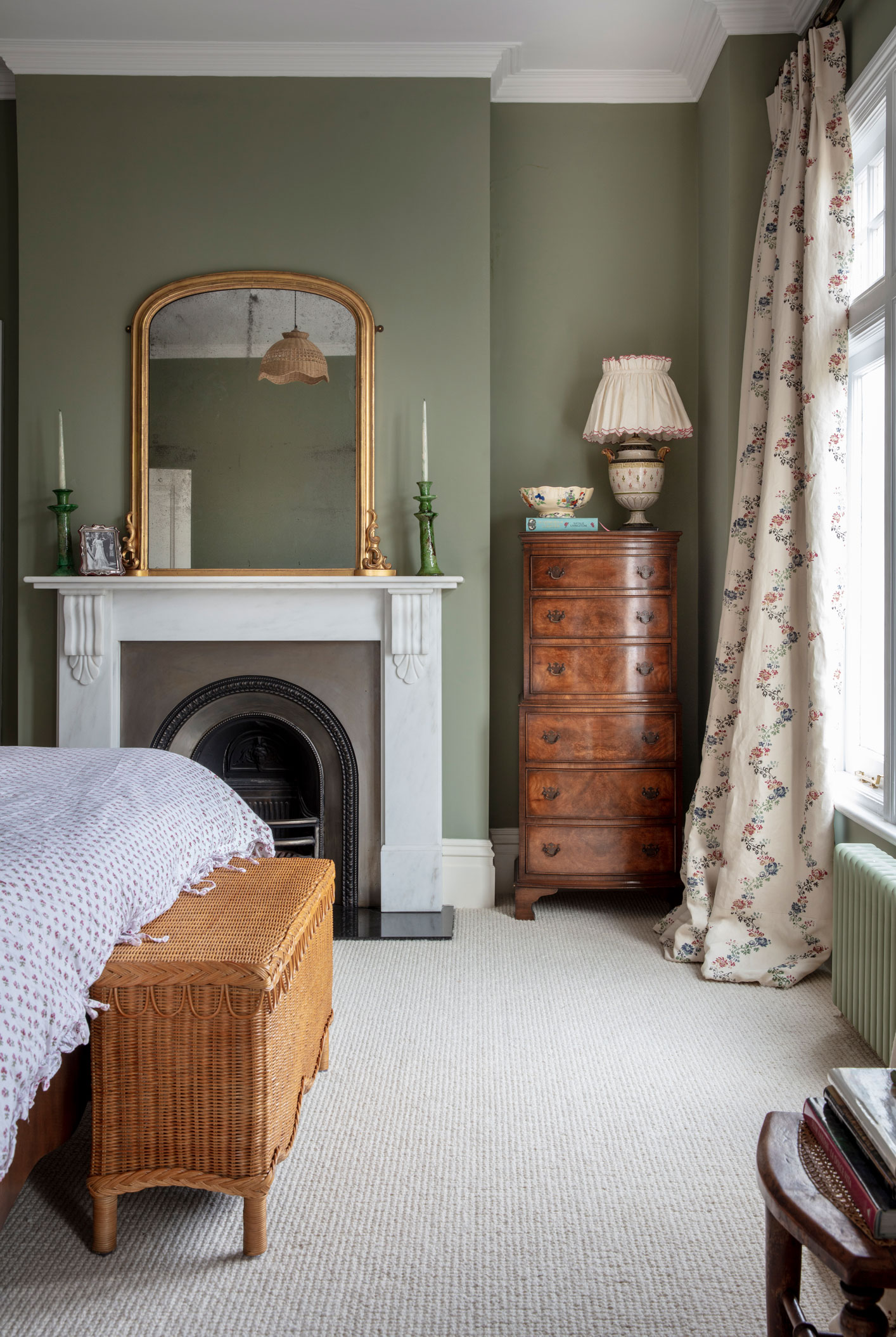
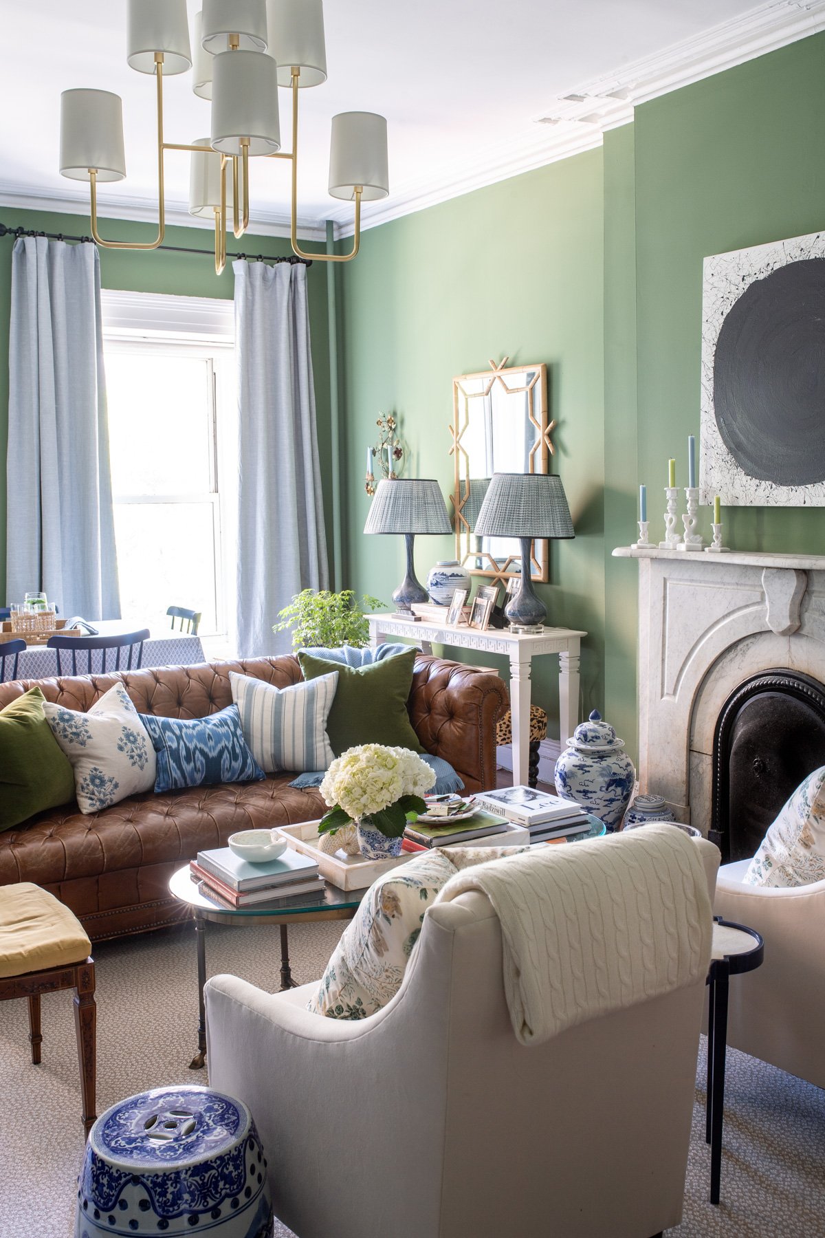
Louise Roe. I’m tellin’ you, the woman doesn’t miss! Everything she decorates turns to gold. So the minute I saw this I was like YES, I need to try this – Lichen. Back to F&B I went, and up on the wall the swatch went. I stared at it and stared at it and moved it around for a few days, and I really liked it the minute I saw it. It was a really mossy, kind of stone colored green, and it just had a certain depth to it. My only hesitation was that it felt like it was skewing a bit yellow to me. I checked with Jen and she assured me that what I was seeing was that it had a lot of warmth to it – which was great, as that fit the vibe I was going for – the warm, cozy, English library feeling. Here it is in an English Georgian home designed by Salvensen Graham:
I was still increasingly enamored with Green Smoke, but ultimately I knew it would look pretty terrible in the kitchen and hallway (which are connected and needed the same paint color) since they really don’t get much light. So with Jen’s encouragement, I finally committed to Lichen! I did the Modern Emulsion which has a little tiny bit more of a sheen to it than F&B’s Estate Emulsion, which is totally flat and difficult to clean – as I mentioned, Lichen also went in the kitchen so it needed to be somewhat cleanable.
Here it is and apologies for not having better/more photos yet!
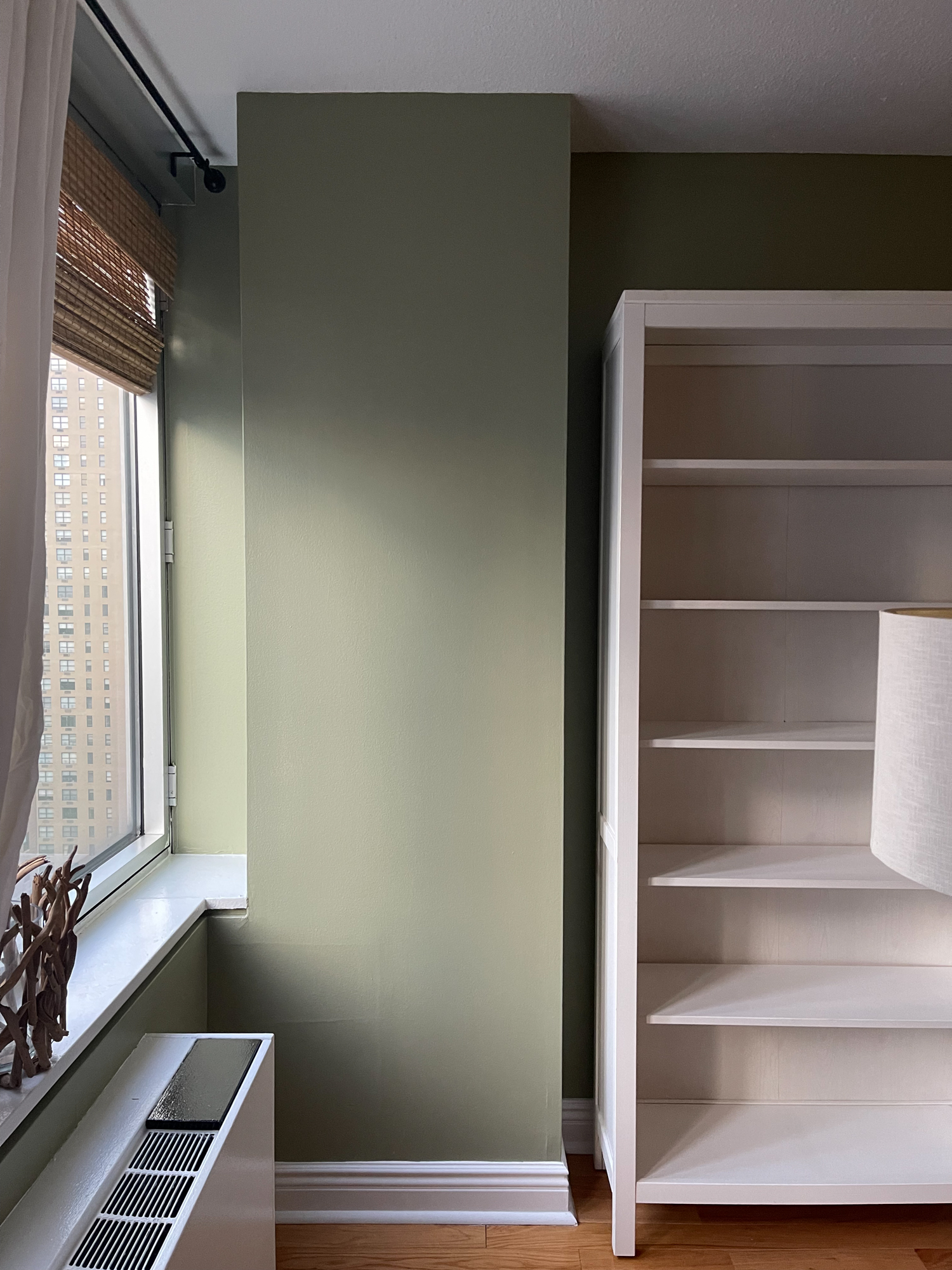
I absolutely LOVE it! I’m so so glad I went with Farrow and Ball Lichen. It’s a moody, warm green that has a lot of depth to it, and it perfectly evokes the mood I was aiming for. Like all Farrow and Ball colors, (well maybe all paint? IDK), it has a tendency to shift and change with the light, and the more I live with it the more I fall in love with it. It has the same vibes as the darker greens, but without being dark. And as much as I’m dying to try a dark paint color, this apartment does not get a ton of light so going dark probably would have been a mistake. Lichen is a perfect happy medium between Breakfast Room and Green Smoke – both of which I hope to use at some point in the future, somewhere, as I adore them.
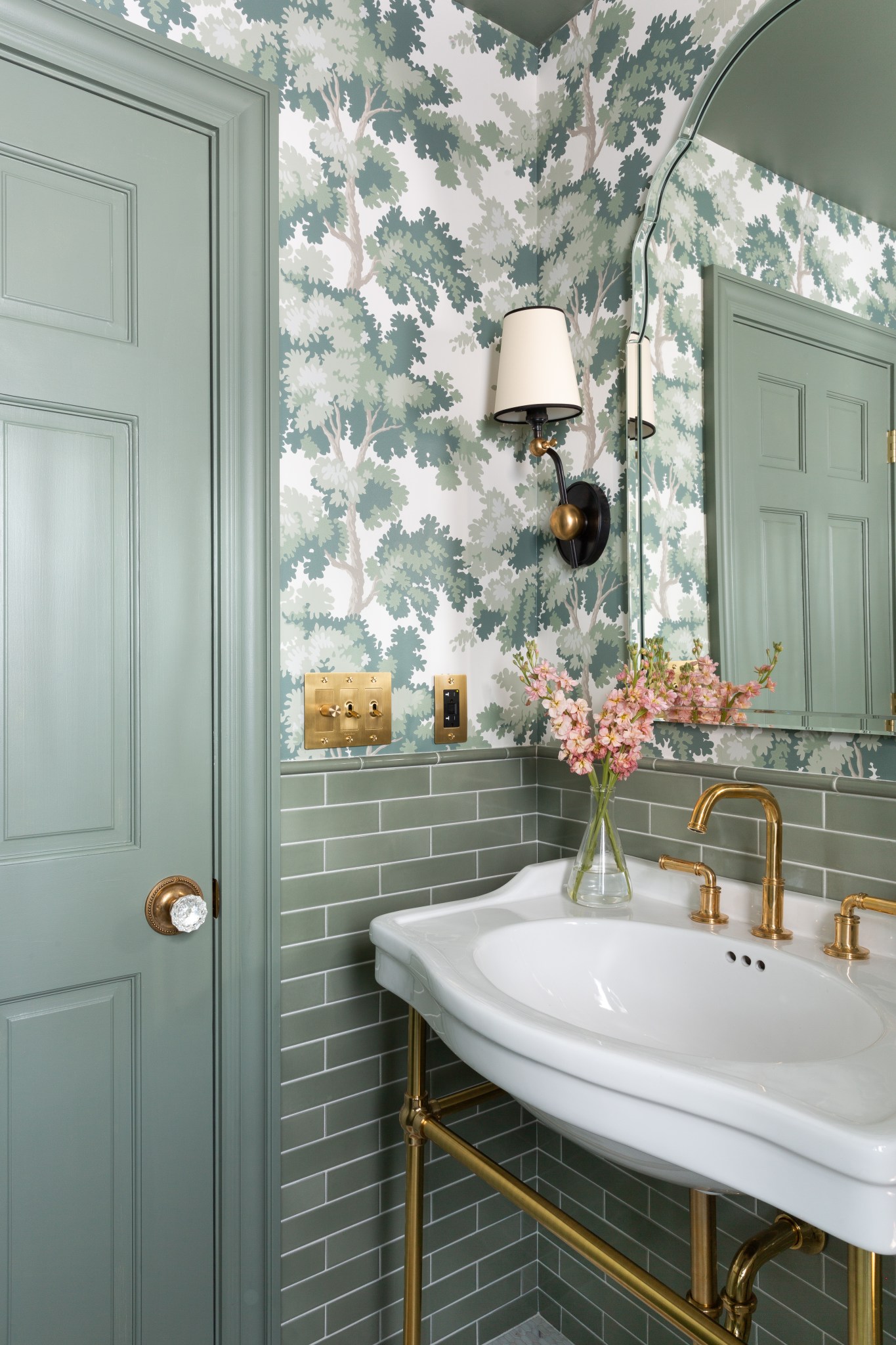
As for the bedroom – Middleton Pink. No drama or decisions there! Jen and I both agreed it was a perfect choice. I used it in the bedroom of my previous one bedroom way back when and I loved it. It’s the perfect still sophisticated bubblegum pink. Pics forthcoming when the bedroom isn’t such an empty mess!

Love the lichen green and I’m so pleased you went with that!! I was very invested in this paint decision along with you 🙂 It’s great to get a sense of the different greens in relation to each other instead of just gazing at the color cards on the F&B site!!
Thanks Sarah! I appreciate it. I’m so glad I went with Lichen too and that it came to my attention at the last minute! It’s such a beautiful color!
This color looks beautiful!
You have done a GREAT job!
Recently we used Sherwin Williams Evergreen Fog the 2022 Color of the Year with GREAT results!
Most of our work is coastal, nautical interiors down the shore yet we began work on a smaller 2 bedroom apartment with a terrace in New York City, with a client that requested an urban coastal/nautical look.
Our client is a bachelor with a beautiful girl friend who is on the premises often nearly all the time.
The budget was enough to fix the place up but not huge.
For a more spacious feeling we used a monochromatic color scheme the living room, hall, bathrooms, bedrooms, eat in kitchen the same Evergreen Fog color it works very well.
We sponge-painted the existing gray concrete floor on the terrace with Evergreen Fog, added a table, chairs, nautical decorations, etc .
A new navy blue sofa in the living room, navy blue bedspreads, shower curtains, window treatments, etc. throughout the apartment. Sisal rugs in each room. A few pops of color here and there that make visitors smile we are told.
Kevin
Sea Girt, New Jersey 08642
Thanks for doing the hard work of comparing the different greens and sharing! Lichen is so beautiful, are you still happy with the results? I was hoping to catch a photo of the finished room but I didn’t see one on your blog. I’m considering some of the same greens that you did and hadn’t even considered Lichen. Those inspiration photos are amazing.
Thank you so much! I’m really glad this was helpful. I absolutely love Lichen and I’m so happy I chose it. I need to get more “after” pics up but you can see some of it here: https://yorkavenueblog.com/apartment-updates-my-new-gallery-wall/
Gorgeous! What a wonderful backdrop for the artwork too. It seems to work so well
with the other colors.
I’m going to need to go get a sample pot!