Seeing the 2013 Holiday House in December reminded me of one of my favorite rooms from a showhouse ever – a space designed by Tobi Fairley for the 2012 Holiday House designer showhouse. I’m not exaggerating when I tell you that I love every single element of this room, and the combination of everything is even better than each piece individually. The space is called “Spring Forward,” and I think she captured that feeling perfectly. It’s light, airy, and fresh-like that first feeling of spring in the air after a long, cold winter.
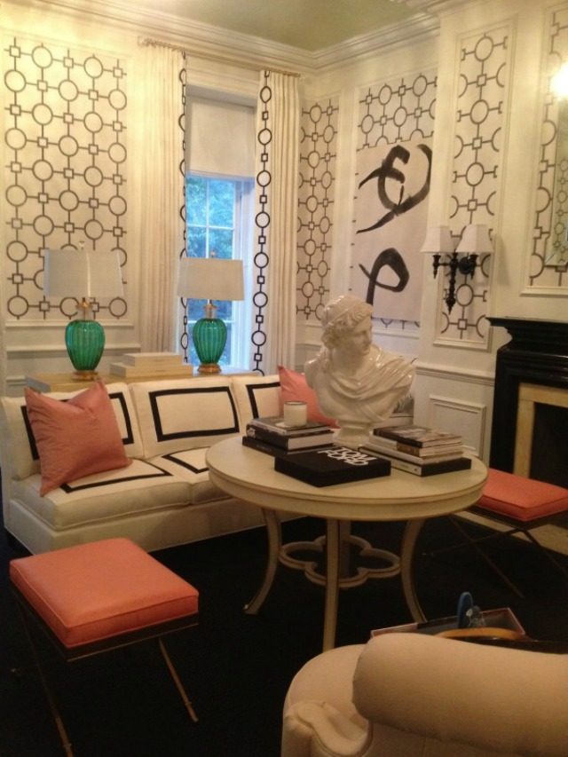
In the picture above, I’m especially head over heels for that INSANE couch, and the bust. If I walk into a room and it has black and white elements, pink, and a bust-I’m sold. The fact that the color palette is so tight here (black, charcoal, white, pink, and just two pops of the most vibrant emerald green) helps the room feel, to me, very clean, and yet the fact that she varied the shades of pink keeps it interesting, never boring or one note. All of the repeating elements used in slightly varying ways (the pink, the wallpaper repeated in the curtain trim, the wavy fabric repeated on several pieces), helps it to feel very pulled together. Having seen this room “in the flesh,” I can attest to the fact that it was even more lovely in person, if you can believe it.
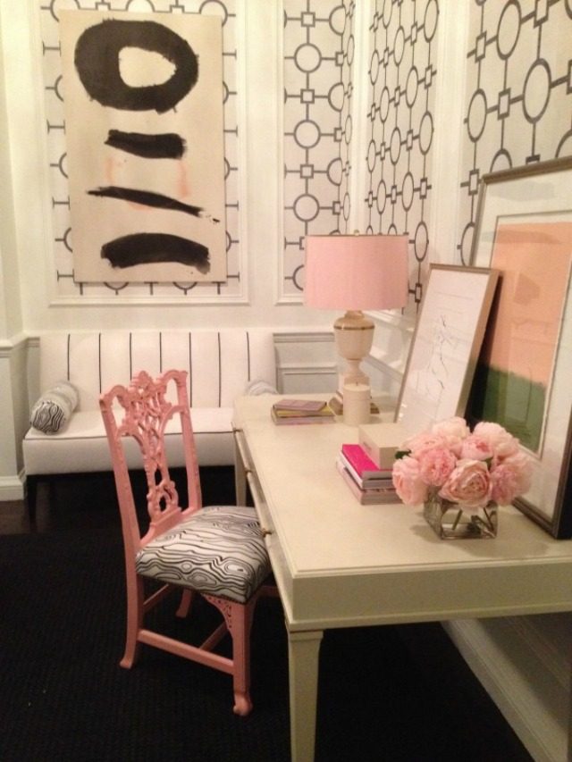
Such a gorgeous wallpaper. I love that she layered a black and white piece of art over it – since the color palettes are similar (I think the wallpaper might be charcoal and white), it adds interest without looking too busy. I LOVE that incredible settee with the black lines on it (again, a layer of black and white) – perfectly simple but so chic. The pink chair is fantastic, especially with that great fabric (another black and white layer!), which you can see is utilized again in the bolsters on the settee-brilliant. The lampshade is the most perfect shade of powder pink – it’s pretty but not at all cloying. I also love the flowers and the green and pink art.
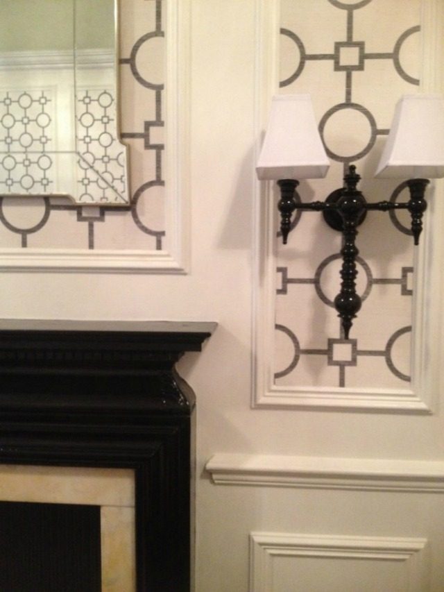
The black sconces are basically amazing, and I love the black mantel as well. I think the sconces look kind of gothic and add a bit of edge to this feminine space. Of course the architectural detailing in the room is just fantastic, and I love how the designer emphasized it by using the wallpaper in the panels.
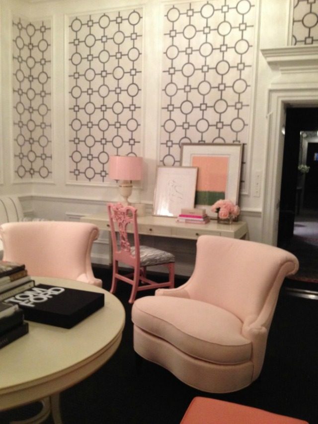
Those chairs just fill me with delight-the shape is so unique, and the color is the PERFECT pale pink. I mean, how did she make pink look so sophisticated? It’s not so easy to use so much of it without bringing to mind a baby’s room, but here there’s nothing twee about it…amazing how she pulled that off. And I’m just really impressed with how well she mixed several different shades of pale pink. If I tried to do that I would feel like they were all clashing, but not so here.
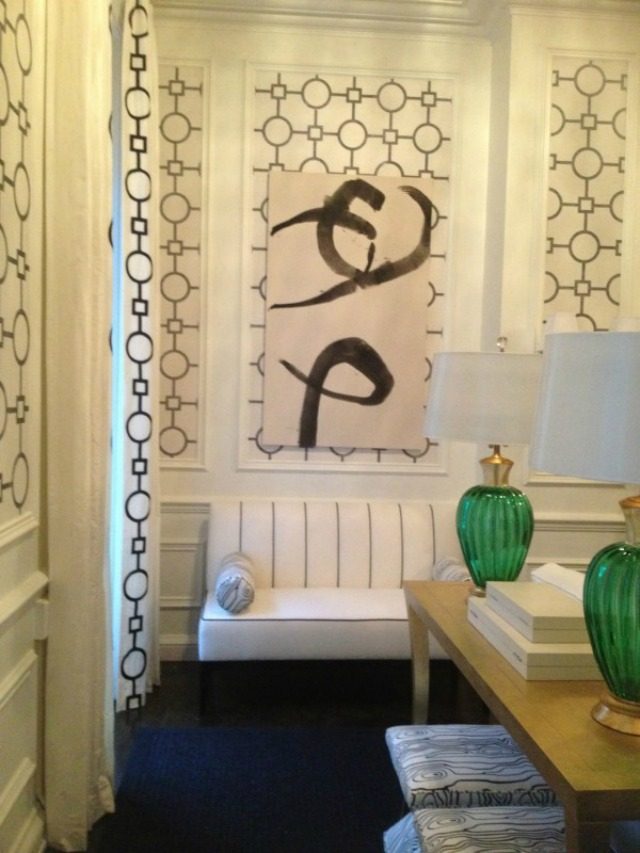
See how the trim on the curtains echoes the pattern on the wallpaper? It just helps the room feel so pulled together. And again the wavy fabric from the desk chair and bolsters is used, here on the benches under the gold console table. And those green lamps look vintage…so lovely.
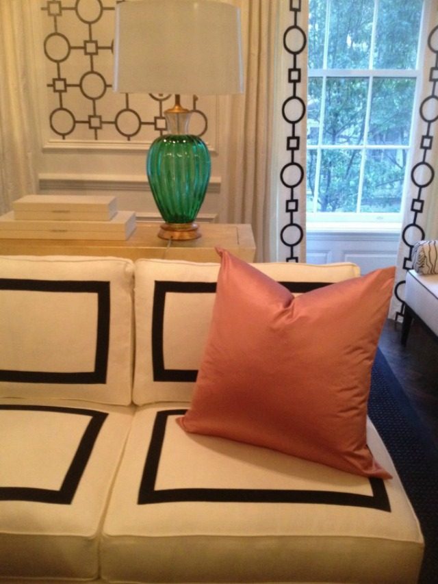
That couch….sigh. It is magnificent. The simple black lines recall the simple black lines of the settees.
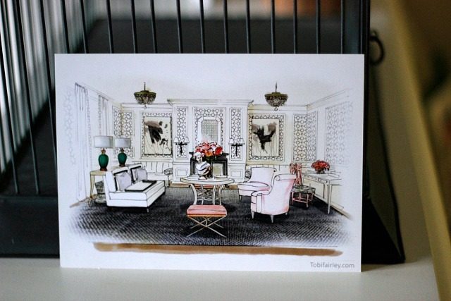
The other fun thing is when a showhouse room gives you a take-home card that features the actual room you’re seeing…it’s nice because it serves as a memory of what you’ve seen that day. This room, in keeping with it’s theme (the theme being perfection), had one of the best cards that I’ve ever gotten at a showhouse-a sketched rendering of the room, which now lives framed on my gallery wall:
All photos (except the last one) via Tobi Fairley’s blog.
What a gorgeous design! I love the little pops of pink with neutral shades!
http://www.bhreaghwho.com
Cheers,
Bhreagh
Me too! She used all of the pink perfectly, I admire her so much!
That rendering is superb! What a fun reminder. I love this room too – it's perfectly feminine and balanced but not in an overdone way. So lucky that you got to visit it! How cool.
I agree…so feminine, but not over the top. I feel like even a guy wouldn't mind this room (maybe 🙂
Little pink accents are so pretty! Too bad I live with a boy 😛
Gorgeous! I love all the upholstery!
Such a beautiful space! You can't go wrong with that color palette.
Ashley
http://allthatglitters.co.nr