
Anyone who follows this blog probably knows that I have a major thing for colorful, feminine studio apartments, and even better if they’re in NYC. So Elizabeth Bauer’s Gramercy Park space, featured waaay back in Lonny’s June/July 2010 issue, has really stuck with me over the years. It’s a fantastic prewar apartment with lots of charm and cool details, including a mantel (my dream), and a cozy little dressing room. In the photo above, you can see how the apartment naturally provides a little “bedroom” space with that tiny step, which I think is such a charming detail. I like how Elizabeth placed that see-through, airy screen there as well, just for the suggestion of further separation. And though I prefer neutrals for the furniture pieces in my own space, I love that she really went for it with color and pattern on that fabulous striped couch. I also like how she only wallpapered the “bedroom” area – another way of visually creating separate rooms. Such a great tip for studio dwellers!
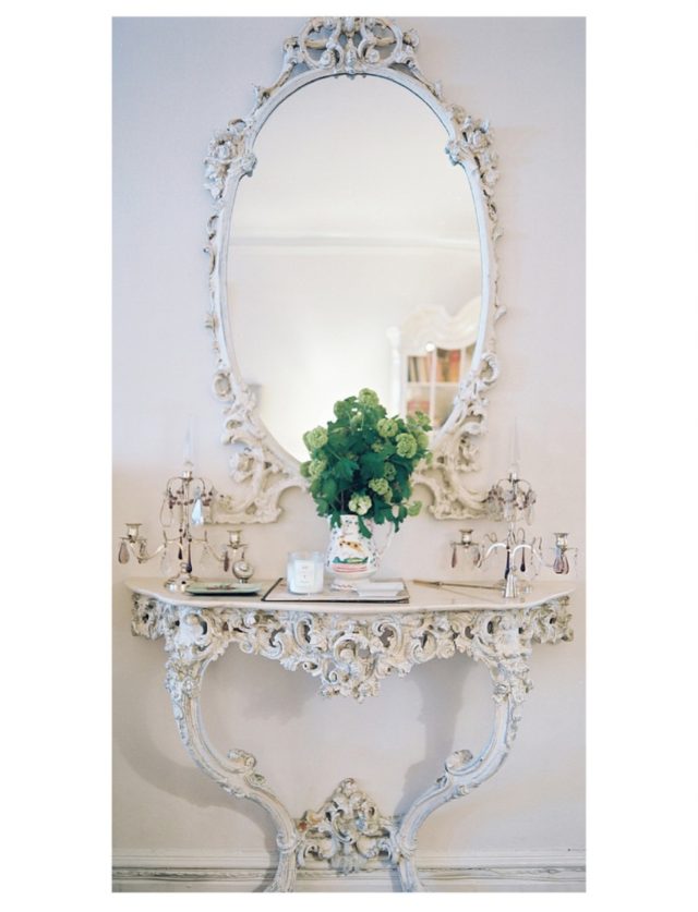
I’m honestly obsessed with this demilune table with matching mirror. It looks like the type of romantic, antique, Victorian piece that you would find in a big old English manor or something. It’s utterly gorgeous and full of character.
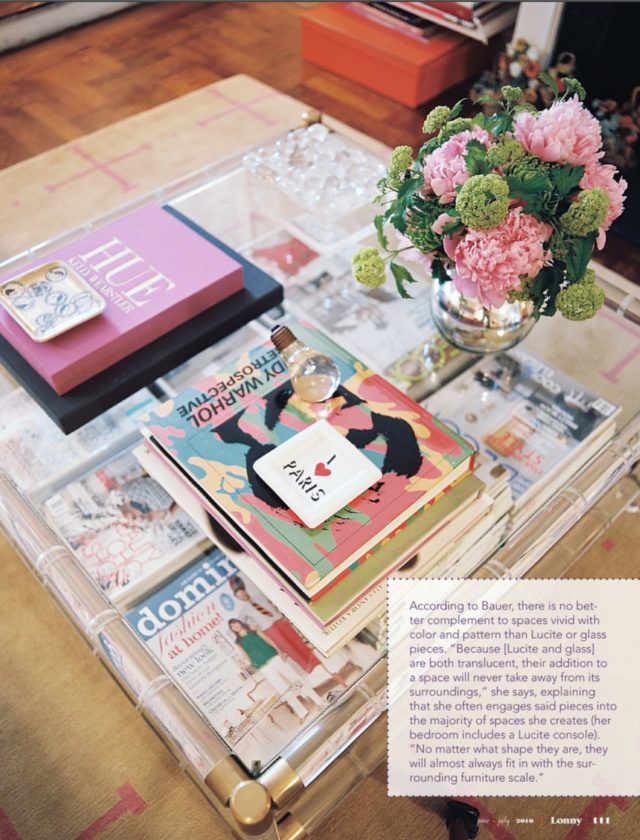
I love this see through coffee table – perfect for a studio, and so fab that you can see right through to the bottom layer full of back issues of Domino! It’s so fun, like having two coffee tables to style.
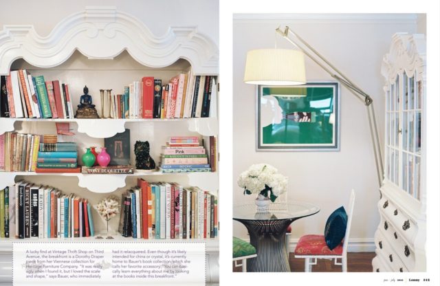
I love, LOVE, the fact that Elizabeth took a big, old china cabinet and turned it into a bookcase. The piece has so much character, and it’s so cool and unexpected to use it for a different purpose than it was intended. And you can imagine how dated and unattractive it probably seemed to begin with (as she says herself)…she gave a vintage piece new life, which I think is the best way to create a unique space that’s all your own.
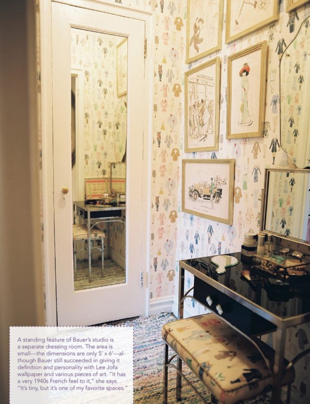
Look at this adorable little dressing room…what a charming feature. And speaking of charming: that wallpaper! And the fact that she used the same fabric on the little bench? Perfection. As she says in that little caption box, it feels very 1940’s French.
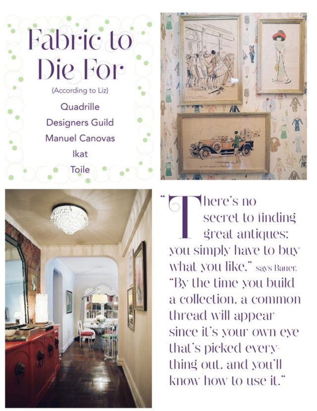
I love that quote above, and I think it’s true not just for antiques shopping, but for decorating in general and picking any accessories/art for your space. Just go with what you love, and the connecting thread will be you – your eye, things that you love. There will be a common look/aesthetic (or several) which might not be readily apparent until you see a few things come together.
Such a cute little place–I love how she wallpapered the "bedroom" space, too!
I know, so cool!
Nice quote
Indeed 🙂
Ob-sessed! There is so much class and history!
I know, I'm obsessed too! 🙂
I love when people are not afraid of bright colors. Elizabeth has a great design style!
-Alex
http://www.monstermisa.blogspot.com/
I agree! She definitely does.
Super genius to use wallpaper to denote the bedroom. Never would have thought of that.
Same here! So impressed with that.
Oh gosh, I know!! Love it!